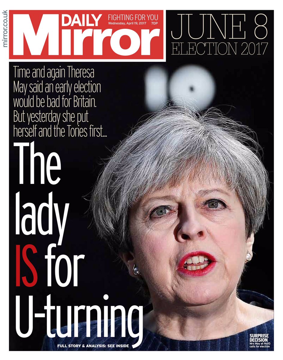
This magazine cover seems to be blacked out and this therefore makes us focus on the close up of Theresa May's face, the fact that the image is whiter than the background image. The text is also white so against the black background it makes the audience bring their attention to this. And the fact that the "IS" is in red and not white like the others highlights the importance of this, it also emphasis on the "IS". Reading all of it together and putting the emphasis on the "IS" it sounds like they are making fun of her decision almost like has gone against her own word. The lighting seems like it taken from the right hand side, giving the left side of her face a shadow. The writing at the top almost seems they are criticzing her, like she is yet again going back on her word. By using two time words "time" and "again" shows how long it has taken and this could be saying she takes her time and they are tired of her and that she changes her opinion a lot, this therefore takes time.
Subscribe to:
Post Comments (Atom)
Vogue
History of Vogue 1892 Arthur Baldwin Turnure was the founder of vogue in the US. The price was 10 cents. The meani...
-
Ethnicity Formation- Beyonce In my opinion I think that this music video has a combination of both, performance and narrative genre...
-
Young the Giant: Cough Syrup In my opinion I think this is more of a rock genre. The music starts off with an underwater scene, w...
-
History of Vogue 1892 Arthur Baldwin Turnure was the founder of vogue in the US. The price was 10 cents. The meani...

No comments:
Post a Comment